HigherFrame
A medium length headline fits here
Here is a more detailed sub-headline that expands on the main idea, helping clarify the purpose and engaging the audience further

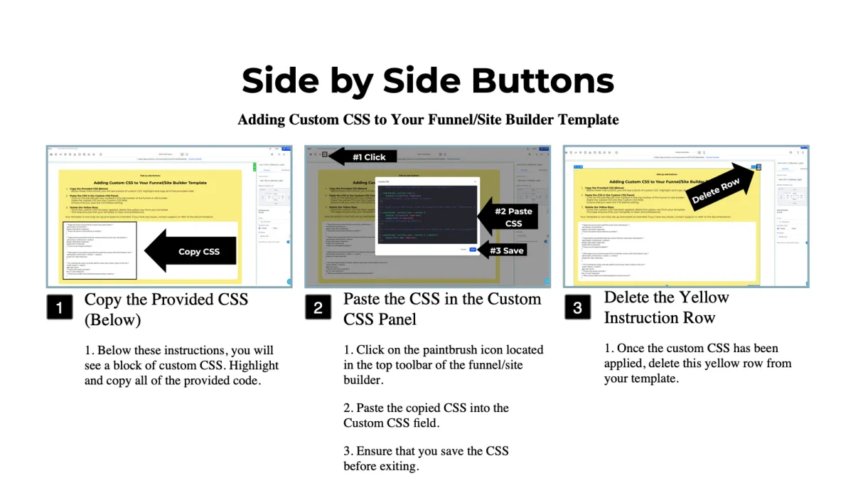
Side-Buttons CSS
What Does This Do and Why Is It Useful?
The site builder provides a couple ways to position buttons side by side, such as using separate columns for each button, or aligning content horizontally within a single column. However, these options fall short if you want buttons placed side by side within a single column that also contains other stacked content or elements.
With this custom CSS, you can overcome these limitations. By following the steps, you'll be able to create clean, side-by-side button layouts within a single column while maintaining flexibility for vertically stacked content. This approach enhances your design capabilities without compromising the layout or requiring additional workarounds.
For a video walkthrough visit higherframe.com/side-buttons
/* Target the parent column with the custom class 'side-buttons' */
.side-buttons .vertical.inner {
display: inline-block !important;
/* Ensure the parent column behaves as needed */
}
/* Target buttons specifically inside the columns with the custom class 'side-buttons' */
.side-buttons .vertical.inner .c-button {
display: inline-block !important;
margin-left: 0 !important;
/* Ensure no left margin by default */
}
/* Add margin to every button except the first inside the columns with 'side-buttons' class */
.side-buttons .vertical.inner .c-button + .c-button {
margin-left: 10px !important;
}
/* For centering the column vertically, add the custom class 'center-column' to the row */
.center-column .c-column {
align-self: center;
/* Centers the column vertically */
flex: 0 1 auto !important;
/* Allow manual width control while keeping the column centered */
}

HigherFrame
A medium length headline fits here
Here is a more detailed sub-headline that expands on the main idea, helping clarify the purpose and engaging the audience further
HigherFrame
A medium length headline fits here
Here is a more detailed sub-headline that expands on the main idea, helping clarify the purpose and engaging the audience further
Side-Buttons CSS
What Does This Do and Why Is It Useful?
The site builder provides a couple ways to position buttons side by side, such as using separate columns for each button, or aligning content horizontally within a single column. However, these options fall short if you want buttons placed side by side within a single column that also contains other stacked content or elements.
With this custom CSS, you can overcome these limitations. By following the steps, you'll be able to create clean, side-by-side button layouts within a single column while maintaining flexibility for vertically stacked content. This approach enhances your design capabilities without compromising the layout or requiring additional workarounds.
For a video walkthrough visit higherframe.com/side-buttons
/* Target the parent column with the custom class 'side-buttons' */
.side-buttons .vertical.inner {
display: inline-block !important;
/* Ensure the parent column behaves as needed */
}
/* Target buttons specifically inside the columns with the custom class 'side-buttons' */
.side-buttons .vertical.inner .c-button {
display: inline-block !important;
margin-left: 0 !important;
/* Ensure no left margin by default */
}
/* Add margin to every button except the first inside the columns with 'side-buttons' class */
.side-buttons .vertical.inner .c-button + .c-button {
margin-left: 10px !important;
}
/* For centering the column vertically, add the custom class 'center-column' to the row */
.center-column .c-column {
align-self: center;
/* Centers the column vertically */
flex: 0 1 auto !important;
/* Allow manual width control while keeping the column centered */
}
HigherFrame
A medium length headline fits here
Here is a more detailed sub-headline that expands on the main idea, helping clarify the purpose and engaging the audience further
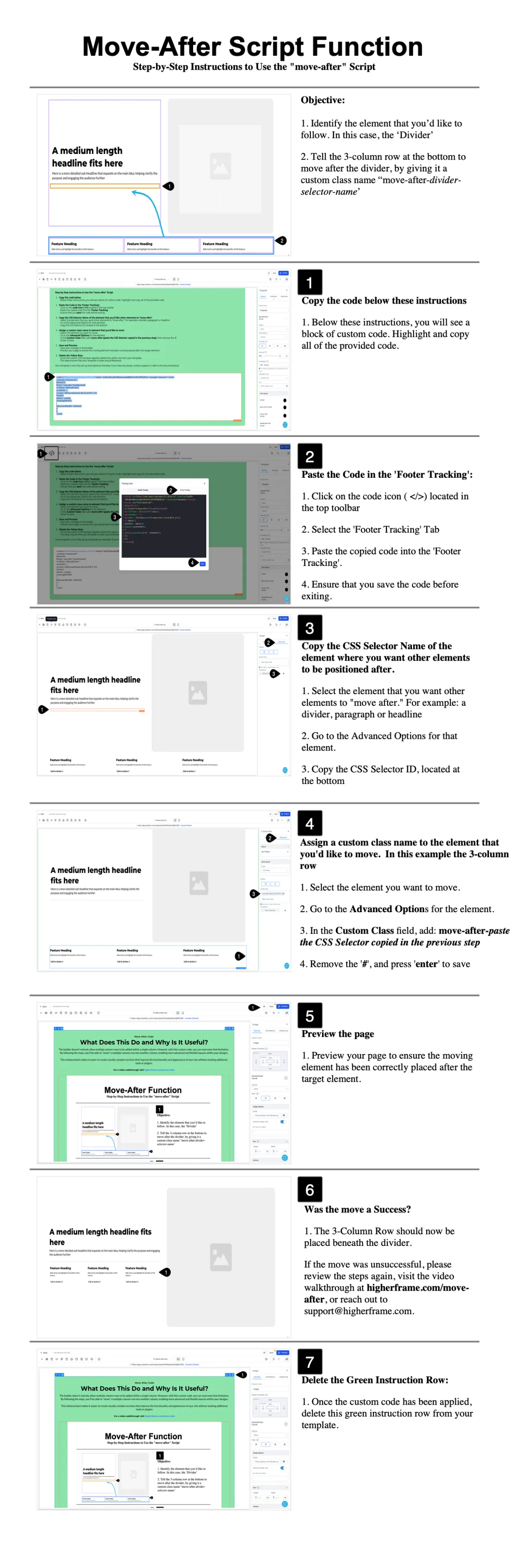
Move-After Script
What Does This Do and Why Is It Useful?
The builder doesn't natively allow multiple column rows to be added within a single column. However, with this custom code, you can overcome that limitation. By following the steps, you'll be able to "move" a multiple-column row into another column, enabling more advanced and flexible layouts within your designs.
This enhancement makes it easier to create visually complex sections that improve the functionality and appearance of your site without needing additional tools or plugins.
For a video walkthrough visit higherframe.com/move-after
<script src="https://code.jquery.com/jquery-3.7.0.min.js" integrity="sha256-2Pmvv0kuTBOenSvLm6bvfBSSHrUJ+3A7x6P5Ebd07/g=" crossorigin="anonymous"></script>
<script type="text/javascript">
$(function () {
$('[class*="move-after-"]').each(function(){
var fullClass = $(this).attr('class');
var afterPart = '';
var match = fullClass.match(/move-after-([a-zA-Z0-9-_]+)/);
if (match) {
afterPart = match[1];
console.log(afterPart);
}
$(this).insertAfter($('#' + afterPart));
});
});
</script>
A medium length headline fits here
Here is a more detailed sub-headline that expands on the main idea, helping clarify the purpose and engaging the audience further
Feature Heading
Add clarity and highlight the benefits of this feature
Feature Heading
Add clarity and highlight the benefits of this feature
Feature Heading
Add clarity and highlight the benefits of this feature
Move-After Script
What Does This Do and Why Is It Useful?
The builder doesn't natively allow multiple column rows to be added within a single column. However, with this custom code, you can overcome that limitation. By following the steps, you'll be able to "move" a multiple-column row into another column, enabling more advanced and flexible layouts within your designs.
This enhancement makes it easier to create visually complex sections that improve the functionality and appearance of your site without needing additional tools or plugins.
For a video walkthrough visit higherframe.com/move-after
<script src="https://code.jquery.com/jquery-3.7.0.min.js" integrity="sha256-2Pmvv0kuTBOenSvLm6bvfBSSHrUJ+3A7x6P5Ebd07/g=" crossorigin="anonymous"></script>
<script type="text/javascript">
$(function () {
$('[class*="move-after-"]').each(function(){
var fullClass = $(this).attr('class');
var afterPart = '';
var match = fullClass.match(/move-after-([a-zA-Z0-9-_]+)/);
if (match) {
afterPart = match[1];
console.log(afterPart);
}
$(this).insertAfter($('#' + afterPart));
});
});
</script>
A medium length headline fits here
Here is a more detailed sub-headline that expands on the main idea, helping clarify the purpose and engaging the audience further

87%
Increase
in Productivity
80%
Reduction
in Manual Tasks
95%
Customer
Retention Rate
Move-After Script
What Does This Do and Why Is It Useful?
The builder doesn't natively allow multiple column rows to be added within a single column. However, with this custom code, you can overcome that limitation. By following the steps, you'll be able to "move" a multiple-column row into another column, enabling more advanced and flexible layouts within your designs.
This enhancement makes it easier to create visually complex sections that improve the functionality and appearance of your site without needing additional tools or plugins.
For a video walkthrough visit higherframe.com/move-after
<script src="https://code.jquery.com/jquery-3.7.0.min.js" integrity="sha256-2Pmvv0kuTBOenSvLm6bvfBSSHrUJ+3A7x6P5Ebd07/g=" crossorigin="anonymous"></script>
<script type="text/javascript">
$(function () {
$('[class*="move-after-"]').each(function(){
var fullClass = $(this).attr('class');
var afterPart = '';
var match = fullClass.match(/move-after-([a-zA-Z0-9-_]+)/);
if (match) {
afterPart = match[1];
console.log(afterPart);
}
$(this).insertAfter($('#' + afterPart));
});
});
</script>
A medium length headline fits here
Here is a more detailed sub-headline that expands on the main idea, helping clarify the purpose and engaging the audience further
87%
Increase
in Productivity
80%
Reduction
in Manual Tasks
95%
Customer
Retention Rate
Move-After Script
What Does This Do and Why Is It Useful?
The builder doesn't natively allow multiple column rows to be added within a single column. However, with this custom code, you can overcome that limitation. By following the steps, you'll be able to "move" a multiple-column row into another column, enabling more advanced and flexible layouts within your designs.
This enhancement makes it easier to create visually complex sections that improve the functionality and appearance of your site without needing additional tools or plugins.
For a video walkthrough visit higherframe.com/move-after
<script src="https://code.jquery.com/jquery-3.7.0.min.js" integrity="sha256-2Pmvv0kuTBOenSvLm6bvfBSSHrUJ+3A7x6P5Ebd07/g=" crossorigin="anonymous"></script>
<script type="text/javascript">
$(function () {
$('[class*="move-after-"]').each(function(){
var fullClass = $(this).attr('class');
var afterPart = '';
var match = fullClass.match(/move-after-([a-zA-Z0-9-_]+)/);
if (match) {
afterPart = match[1];
console.log(afterPart);
}
$(this).insertAfter($('#' + afterPart));
});
});
</script>
A medium length headline fits here
Here is a more detailed sub-headline that expands on the main idea, helping clarify the purpose and engaging the audience further

Feature Heading
Add clarity and highlight the benefits of this feature
Feature Heading
Add clarity and highlight the benefits of this feature
Feature Heading
Add clarity and highlight the benefits of this feature
Side-Buttons CSS
What Does This Do and Why Is It Useful?
The site builder provides a couple ways to position buttons side by side, such as using separate columns for each button, or aligning content horizontally within a single column. However, these options fall short if you want buttons placed side by side within a single column that also contains other stacked content or elements.
With this custom CSS, you can overcome these limitations. By following the steps, you'll be able to create clean, side-by-side button layouts within a single column while maintaining flexibility for vertically stacked content. This approach enhances your design capabilities without compromising the layout or requiring additional workarounds.
For a video walkthrough visit higherframe.com/side-buttons
/* Target the parent column with the custom class 'side-buttons' */
.side-buttons .vertical.inner {
display: inline-block !important;
/* Ensure the parent column behaves as needed */
}
/* Target buttons specifically inside the columns with the custom class 'side-buttons' */
.side-buttons .vertical.inner .c-button {
display: inline-block !important;
margin-left: 0 !important;
/* Ensure no left margin by default */
}
/* Add margin to every button except the first inside the columns with 'side-buttons' class */
.side-buttons .vertical.inner .c-button + .c-button {
margin-left: 10px !important;
}
/* For centering the column vertically, add the custom class 'center-column' to the row */
.center-column .c-column {
align-self: center;
/* Centers the column vertically */
flex: 0 1 auto !important;
/* Allow manual width control while keeping the column centered */
}
Feature Heading
Add clarity and highlight the benefits of this feature
Feature Heading
Add clarity and highlight the benefits of this feature
Feature Heading
Add clarity and highlight the benefits of this feature
A medium length headline fits here
Here is a more detailed sub-headline that expands on the main idea, helping clarify the purpose and engaging the audience further
Feature Heading
Add clarity and highlight the benefits of this feature
Feature Heading
Add clarity and highlight the benefits of this feature
Feature Heading
Add clarity and highlight the benefits of this feature
Side-Buttons CSS
What Does This Do and Why Is It Useful?
The site builder provides a couple ways to position buttons side by side, such as using separate columns for each button, or aligning content horizontally within a single column. However, these options fall short if you want buttons placed side by side within a single column that also contains other stacked content or elements.
With this custom CSS, you can overcome these limitations. By following the steps, you'll be able to create clean, side-by-side button layouts within a single column while maintaining flexibility for vertically stacked content. This approach enhances your design capabilities without compromising the layout or requiring additional workarounds.
For a video walkthrough visit higherframe.com/side-buttons
/* Target the parent column with the custom class 'side-buttons' */
.side-buttons .vertical.inner {
display: inline-block !important;
/* Ensure the parent column behaves as needed */
}
/* Target buttons specifically inside the columns with the custom class 'side-buttons' */
.side-buttons .vertical.inner .c-button {
display: inline-block !important;
margin-left: 0 !important;
/* Ensure no left margin by default */
}
/* Add margin to every button except the first inside the columns with 'side-buttons' class */
.side-buttons .vertical.inner .c-button + .c-button {
margin-left: 10px !important;
}
/* For centering the column vertically, add the custom class 'center-column' to the row */
.center-column .c-column {
align-self: center;
/* Centers the column vertically */
flex: 0 1 auto !important;
/* Allow manual width control while keeping the column centered */
}
Feature Heading
Add clarity and highlight the benefits of this feature
Feature Heading
Add clarity and highlight the benefits of this feature
Feature Heading
Add clarity and highlight the benefits of this feature
A medium length headline fits here
Here is a more detailed sub-headline that expands on the main idea, helping clarify the purpose and engaging the audience further
Feature Heading
Add clarity and highlight the benefits of this feature
Feature Heading
Add clarity and highlight the benefits of this feature
Feature Heading
Add clarity and highlight the benefits of this feature
A medium length headline fits here
Here is a more detailed sub-headline that expands on the main idea, helping clarify the purpose and engaging the audience further

87%
Increase in Productivity
80%
Reduction in Manual Tasks
95%
Client Retention Rate
1K+
Total Users
Side-Buttons CSS
What Does This Do and Why Is It Useful?
The site builder provides a couple ways to position buttons side by side, such as using separate columns for each button, or aligning content horizontally within a single column. However, these options fall short if you want buttons placed side by side within a single column that also contains other stacked content or elements.
With this custom CSS, you can overcome these limitations. By following the steps, you'll be able to create clean, side-by-side button layouts within a single column while maintaining flexibility for vertically stacked content. This approach enhances your design capabilities without compromising the layout or requiring additional workarounds.
For a video walkthrough visit higherframe.com/side-buttons
/* Target the parent column with the custom class 'side-buttons' */
.side-buttons .vertical.inner {
display: inline-block !important;
/* Ensure the parent column behaves as needed */
}
/* Target buttons specifically inside the columns with the custom class 'side-buttons' */
.side-buttons .vertical.inner .c-button {
display: inline-block !important;
margin-left: 0 !important;
/* Ensure no left margin by default */
}
/* Add margin to every button except the first inside the columns with 'side-buttons' class */
.side-buttons .vertical.inner .c-button + .c-button {
margin-left: 10px !important;
}
/* For centering the column vertically, add the custom class 'center-column' to the row */
.center-column .c-column {
align-self: center;
/* Centers the column vertically */
flex: 0 1 auto !important;
/* Allow manual width control while keeping the column centered */
}
87%
Increase in Productivity
80%
Reduction in Manual Tasks
95%
Client Retention Rate
1K+
Total Users
A medium length headline fits here
Here is a more detailed sub-headline that expands on the main idea, helping clarify the purpose and engaging the audience further
87%
Increase in Productivity
80%
Reduction in Manual Tasks
95%
Client Retention Rate
1K+
Total Users
A medium length headline fits here
Here is a more detailed sub-headline that expands on the main idea, helping clarify the purpose and engaging the audience further
87%
Increase in Productivity
80%
Reduction in Manual Tasks
95%
Client Retention Rate
1K+
Total Users
Side-Buttons CSS
What Does This Do and Why Is It Useful?
The site builder provides a couple ways to position buttons side by side, such as using separate columns for each button, or aligning content horizontally within a single column. However, these options fall short if you want buttons placed side by side within a single column that also contains other stacked content or elements.
With this custom CSS, you can overcome these limitations. By following the steps, you'll be able to create clean, side-by-side button layouts within a single column while maintaining flexibility for vertically stacked content. This approach enhances your design capabilities without compromising the layout or requiring additional workarounds.
For a video walkthrough visit higherframe.com/side-buttons
/* Target the parent column with the custom class 'side-buttons' */
.side-buttons .vertical.inner {
display: inline-block !important;
/* Ensure the parent column behaves as needed */
}
/* Target buttons specifically inside the columns with the custom class 'side-buttons' */
.side-buttons .vertical.inner .c-button {
display: inline-block !important;
margin-left: 0 !important;
/* Ensure no left margin by default */
}
/* Add margin to every button except the first inside the columns with 'side-buttons' class */
.side-buttons .vertical.inner .c-button + .c-button {
margin-left: 10px !important;
}
/* For centering the column vertically, add the custom class 'center-column' to the row */
.center-column .c-column {
align-self: center;
/* Centers the column vertically */
flex: 0 1 auto !important;
/* Allow manual width control while keeping the column centered */
}
87%
Increase in Productivity
80%
Reduction in Manual Tasks
95%
Client Retention Rate
1K+
Total Users
A medium length headline fits here
Here is a more detailed sub-headline that expands on the main idea, helping clarify the purpose and engaging the audience further
87%
Increase in Productivity
80%
Reduction in Manual Tasks
95%
Client Retention Rate
1K+
Total Users
A medium length headline fits here
Here is a more detailed sub-headline that expands on the main idea, helping clarify the purpose and engaging the audience further


Side-Buttons CSS
What Does This Do and Why Is It Useful?
The site builder provides a couple ways to position buttons side by side, such as using separate columns for each button, or aligning content horizontally within a single column. However, these options fall short if you want buttons placed side by side within a single column that also contains other stacked content or elements.
With this custom CSS, you can overcome these limitations. By following the steps, you'll be able to create clean, side-by-side button layouts within a single column while maintaining flexibility for vertically stacked content. This approach enhances your design capabilities without compromising the layout or requiring additional workarounds.
For a video walkthrough visit higherframe.com/side-buttons
/* Target the parent column with the custom class 'side-buttons' */
.side-buttons .vertical.inner {
display: inline-block !important;
/* Ensure the parent column behaves as needed */
}
/* Target buttons specifically inside the columns with the custom class 'side-buttons' */
.side-buttons .vertical.inner .c-button {
display: inline-block !important;
margin-left: 0 !important;
/* Ensure no left margin by default */
}
/* Add margin to every button except the first inside the columns with 'side-buttons' class */
.side-buttons .vertical.inner .c-button + .c-button {
margin-left: 10px !important;
}
/* For centering the column vertically, add the custom class 'center-column' to the row */
.center-column .c-column {
align-self: center;
/* Centers the column vertically */
flex: 0 1 auto !important;
/* Allow manual width control while keeping the column centered */
}
A medium length headline fits here
Here is a more detailed sub-headline that expands on the main idea, helping clarify the purpose and engaging the audience further
A medium length headline fits here
Here is a more detailed sub-headline that expands on the main idea, helping clarify the purpose and engaging the audience further

Side-Buttons CSS
What Does This Do and Why Is It Useful?
The site builder provides a couple ways to position buttons side by side, such as using separate columns for each button, or aligning content horizontally within a single column. However, these options fall short if you want buttons placed side by side within a single column that also contains other stacked content or elements.
With this custom CSS, you can overcome these limitations. By following the steps, you'll be able to create clean, side-by-side button layouts within a single column while maintaining flexibility for vertically stacked content. This approach enhances your design capabilities without compromising the layout or requiring additional workarounds.
For a video walkthrough visit higherframe.com/side-buttons
/* Target the parent column with the custom class 'side-buttons' */
.side-buttons .vertical.inner {
display: inline-block !important;
/* Ensure the parent column behaves as needed */
}
/* Target buttons specifically inside the columns with the custom class 'side-buttons' */
.side-buttons .vertical.inner .c-button {
display: inline-block !important;
margin-left: 0 !important;
/* Ensure no left margin by default */
}
/* Add margin to every button except the first inside the columns with 'side-buttons' class */
.side-buttons .vertical.inner .c-button + .c-button {
margin-left: 10px !important;
}
/* For centering the column vertically, add the custom class 'center-column' to the row */
.center-column .c-column {
align-self: center;
/* Centers the column vertically */
flex: 0 1 auto !important;
/* Allow manual width control while keeping the column centered */
}
A medium length headline fits here

A medium length headline fits here
Here is a more detailed sub-headline that expands on the main idea, helping clarify the purpose and engaging the audience further
A medium length headline fits here
Here is a more detailed sub-headline that expands on the main idea, helping clarify the purpose and engaging the audience further
Side-Buttons CSS
What Does This Do and Why Is It Useful?
The site builder provides a couple ways to position buttons side by side, such as using separate columns for each button, or aligning content horizontally within a single column. However, these options fall short if you want buttons placed side by side within a single column that also contains other stacked content or elements.
With this custom CSS, you can overcome these limitations. By following the steps, you'll be able to create clean, side-by-side button layouts within a single column while maintaining flexibility for vertically stacked content. This approach enhances your design capabilities without compromising the layout or requiring additional workarounds.
For a video walkthrough visit higherframe.com/side-buttons
/* Target the parent column with the custom class 'side-buttons' */
.side-buttons .vertical.inner {
display: inline-block !important;
/* Ensure the parent column behaves as needed */
}
/* Target buttons specifically inside the columns with the custom class 'side-buttons' */
.side-buttons .vertical.inner .c-button {
display: inline-block !important;
margin-left: 0 !important;
/* Ensure no left margin by default */
}
/* Add margin to every button except the first inside the columns with 'side-buttons' class */
.side-buttons .vertical.inner .c-button + .c-button {
margin-left: 10px !important;
}
/* For centering the column vertically, add the custom class 'center-column' to the row */
.center-column .c-column {
align-self: center;
/* Centers the column vertically */
flex: 0 1 auto !important;
/* Allow manual width control while keeping the column centered */
}
A medium length headline fits here
A medium length headline fits here
Here is a more detailed sub-headline that expands on the main idea, helping clarify the purpose and engaging the audience further
A longer, more descriptive headline fits well here
Here is a more detailed sub-headline that expands on the main idea, helping clarify the purpose and engaging the audience further
Side-Buttons CSS
What Does This Do and Why Is It Useful?
The site builder provides a couple ways to position buttons side by side, such as using separate columns for each button, or aligning content horizontally within a single column. However, these options fall short if you want buttons placed side by side within a single column that also contains other stacked content or elements.
With this custom CSS, you can overcome these limitations. By following the steps, you'll be able to create clean, side-by-side button layouts within a single column while maintaining flexibility for vertically stacked content. This approach enhances your design capabilities without compromising the layout or requiring additional workarounds.
For a video walkthrough visit higherframe.com/side-buttons
/* Target the parent column with the custom class 'side-buttons' */
.side-buttons .vertical.inner {
display: inline-block !important;
/* Ensure the parent column behaves as needed */
}
/* Target buttons specifically inside the columns with the custom class 'side-buttons' */
.side-buttons .vertical.inner .c-button {
display: inline-block !important;
margin-left: 0 !important;
/* Ensure no left margin by default */
}
/* Add margin to every button except the first inside the columns with 'side-buttons' class */
.side-buttons .vertical.inner .c-button + .c-button {
margin-left: 10px !important;
}
/* For centering the column vertically, add the custom class 'center-column' to the row */
.center-column .c-column {
align-self: center;
/* Centers the column vertically */
flex: 0 1 auto !important;
/* Allow manual width control while keeping the column centered */
}
A longer, more descriptive headline fits well here
Here is a more detailed sub-headline that expands on the main idea, helping clarify the purpose and engaging the audience further
A longer, more descriptive headline fits well here
Here is a more detailed sub-headline that expands on the main idea, helping clarify the purpose and engaging the audience further
Side-Buttons CSS
What Does This Do and Why Is It Useful?
The site builder provides a couple ways to position buttons side by side, such as using separate columns for each button, or aligning content horizontally within a single column. However, these options fall short if you want buttons placed side by side within a single column that also contains other stacked content or elements.
With this custom CSS, you can overcome these limitations. By following the steps, you'll be able to create clean, side-by-side button layouts within a single column while maintaining flexibility for vertically stacked content. This approach enhances your design capabilities without compromising the layout or requiring additional workarounds.
For a video walkthrough visit higherframe.com/side-buttons
/* Target the parent column with the custom class 'side-buttons' */
.side-buttons .vertical.inner {
display: inline-block !important;
/* Ensure the parent column behaves as needed */
}
/* Target buttons specifically inside the columns with the custom class 'side-buttons' */
.side-buttons .vertical.inner .c-button {
display: inline-block !important;
margin-left: 0 !important;
/* Ensure no left margin by default */
}
/* Add margin to every button except the first inside the columns with 'side-buttons' class */
.side-buttons .vertical.inner .c-button + .c-button {
margin-left: 10px !important;
}
/* For centering the column vertically, add the custom class 'center-column' to the row */
.center-column .c-column {
align-self: center;
/* Centers the column vertically */
flex: 0 1 auto !important;
/* Allow manual width control while keeping the column centered */
}
A longer, more descriptive headline fits well here
Here is a more detailed sub-headline that expands on the main idea, helping clarify the purpose and engaging the audience further

A medium length headline fits here
Here is a more detailed sub-headline that expands on the main idea, helping clarify the purpose and engaging the audience further
Side-Buttons CSS
What Does This Do and Why Is It Useful?
The site builder provides a couple ways to position buttons side by side, such as using separate columns for each button, or aligning content horizontally within a single column. However, these options fall short if you want buttons placed side by side within a single column that also contains other stacked content or elements.
With this custom CSS, you can overcome these limitations. By following the steps, you'll be able to create clean, side-by-side button layouts within a single column while maintaining flexibility for vertically stacked content. This approach enhances your design capabilities without compromising the layout or requiring additional workarounds.
For a video walkthrough visit higherframe.com/side-buttons
/* Target the parent column with the custom class 'side-buttons' */
.side-buttons .vertical.inner {
display: inline-block !important;
/* Ensure the parent column behaves as needed */
}
/* Target buttons specifically inside the columns with the custom class 'side-buttons' */
.side-buttons .vertical.inner .c-button {
display: inline-block !important;
margin-left: 0 !important;
/* Ensure no left margin by default */
}
/* Add margin to every button except the first inside the columns with 'side-buttons' class */
.side-buttons .vertical.inner .c-button + .c-button {
margin-left: 10px !important;
}
/* For centering the column vertically, add the custom class 'center-column' to the row */
.center-column .c-column {
align-self: center;
/* Centers the column vertically */
flex: 0 1 auto !important;
/* Allow manual width control while keeping the column centered */
}

A medium length headline fits here
A medium length headline fits here
Here is a more detailed sub-headline that expands on the main idea, helping clarify the purpose and engaging the audience further
A medium length headline fits here
Here is a more detailed sub-headline that expands on the main idea, helping clarify the purpose and engaging the audience further
Side-Buttons CSS
What Does This Do and Why Is It Useful?
The site builder provides a couple ways to position buttons side by side, such as using separate columns for each button, or aligning content horizontally within a single column. However, these options fall short if you want buttons placed side by side within a single column that also contains other stacked content or elements.
With this custom CSS, you can overcome these limitations. By following the steps, you'll be able to create clean, side-by-side button layouts within a single column while maintaining flexibility for vertically stacked content. This approach enhances your design capabilities without compromising the layout or requiring additional workarounds.
For a video walkthrough visit higherframe.com/side-buttons
/* Target the parent column with the custom class 'side-buttons' */
.side-buttons .vertical.inner {
display: inline-block !important;
/* Ensure the parent column behaves as needed */
}
/* Target buttons specifically inside the columns with the custom class 'side-buttons' */
.side-buttons .vertical.inner .c-button {
display: inline-block !important;
margin-left: 0 !important;
/* Ensure no left margin by default */
}
/* Add margin to every button except the first inside the columns with 'side-buttons' class */
.side-buttons .vertical.inner .c-button + .c-button {
margin-left: 10px !important;
}
/* For centering the column vertically, add the custom class 'center-column' to the row */
.center-column .c-column {
align-self: center;
/* Centers the column vertically */
flex: 0 1 auto !important;
/* Allow manual width control while keeping the column centered */
}
A medium length headline fits here
A medium length headline fits here
Here is a more detailed sub-headline that expands on the main idea, helping clarify the purpose and engaging the audience further
HigherFrame
A medium length headline fits here
Here is a more detailed sub-headline that expands on the main idea, helping clarify the purpose and engaging the audience further
HigherFrame
A medium length headline fits here
Here is a more detailed sub-headline that expands on the main idea, helping clarify the purpose and engaging the audience further
HigherFrame
A medium length headline fits here
Here is a more detailed sub-headline that expands on the main idea, helping clarify the purpose and engaging the audience further
HigherFrame
A medium length headline fits here
Here is a more detailed sub-headline that expands on the main idea, helping clarify the purpose and engaging the audience further
HigherFrame
A medium length headline fits here
Here is a more detailed sub-headline that expands on the main idea, helping clarify the purpose and engaging the audience further
HigherFrame
A medium length headline fits here
Here is a more detailed sub-headline that expands on the main idea, helping clarify the purpose and engaging the audience further
HigherFrame
A medium length headline fits here
Here is a more detailed sub-headline that expands on the main idea, helping clarify the purpose and engaging the audience further
HigherFrame
A medium length headline fits here
Here is a more detailed sub-headline that expands on the main idea, helping clarify the purpose and engaging the audience further
HigherFrame
A medium length headline fits here
Here is a more detailed sub-headline that expands on the main idea, helping clarify the purpose and engaging the audience further
HigherFrame
A medium length headline fits here
Here is a more detailed sub-headline that expands on the main idea, helping clarify the purpose and engaging the audience further
Feature Heading
Add clarity and highlight the benefits of this feature
Feature Heading
Add clarity and highlight the benefits of this feature
Feature Heading
Add clarity and highlight the benefits of this feature
HigherFrame
A medium length headline fits here
Here is a more detailed sub-headline that expands on the main idea, helping clarify the purpose and engaging the audience further
87%
Increase in Productivity
80%
Reduction in Manual Tasks
95%
Client Retention Rate
1K+
Total Users
HigherFrame
A medium length headline fits here
Here is a more detailed sub-headline that expands on the main idea, helping clarify the purpose and engaging the audience further
87%
Increase in Productivity
80%
Reduction in Manual Tasks
95%
Client Retention Rate
1K+
Total Users
HigherFrame
A medium length headline fits here
Here is a more detailed sub-headline that expands on the main idea, helping clarify the purpose and engaging the audience further
87%
Increase in Productivity
80%
Reduction in Manual Tasks
95%
Client Retention Rate
1K+
Total Users
HigherFrame
A medium length headline fits here
Here is a more detailed sub-headline that expands on the main idea, helping clarify the purpose and engaging the audience further
HigherFrame
A medium length headline fits here
Here is a more detailed sub-headline that expands on the main idea, helping clarify the purpose and engaging the audience further
HigherFrame
A medium length headline fits here
Here is a more detailed sub-headline that expands on the main idea, helping clarify the purpose and engaging the audience further
HigherFrame
A medium length headline fits here
Here is a more detailed sub-headline that expands on the main idea, helping clarify the purpose and engaging the audience further
Side-Buttons CSS
What Does This Do and Why Is It Useful?
The site builder provides a couple ways to position buttons side by side, such as using separate columns for each button, or aligning content horizontally within a single column. However, these options fall short if you want buttons placed side by side within a single column that also contains other stacked content or elements.
With this custom CSS, you can overcome these limitations. By following the steps, you'll be able to create clean, side-by-side button layouts within a single column while maintaining flexibility for vertically stacked content. This approach enhances your design capabilities without compromising the layout or requiring additional workarounds.
For a video walkthrough visit higherframe.com/side-buttons
/* Target the parent column with the custom class 'side-buttons' */
.side-buttons .vertical.inner {
display: inline-block !important;
/* Ensure the parent column behaves as needed */
}
/* Target buttons specifically inside the columns with the custom class 'side-buttons' */
.side-buttons .vertical.inner .c-button {
display: inline-block !important;
margin-left: 0 !important;
/* Ensure no left margin by default */
}
/* Add margin to every button except the first inside the columns with 'side-buttons' class */
.side-buttons .vertical.inner .c-button + .c-button {
margin-left: 10px !important;
}
/* For centering the column vertically, add the custom class 'center-column' to the row */
.center-column .c-column {
align-self: center;
/* Centers the column vertically */
flex: 0 1 auto !important;
/* Allow manual width control while keeping the column centered */
}
HigherFrame
A medium length headline fits here
Here is a more detailed sub-headline that expands on the main idea, helping clarify the purpose and engaging the audience further
HigherFrame
A medium length headline fits here
Here is a more detailed sub-headline that expands on the main idea, helping clarify the purpose and engaging the audience further
Side-Buttons CSS
What Does This Do and Why Is It Useful?
The site builder provides a couple ways to position buttons side by side, such as using separate columns for each button, or aligning content horizontally within a single column. However, these options fall short if you want buttons placed side by side within a single column that also contains other stacked content or elements.
With this custom CSS, you can overcome these limitations. By following the steps, you'll be able to create clean, side-by-side button layouts within a single column while maintaining flexibility for vertically stacked content. This approach enhances your design capabilities without compromising the layout or requiring additional workarounds.
For a video walkthrough visit higherframe.com/side-buttons
/* Target the parent column with the custom class 'side-buttons' */
.side-buttons .vertical.inner {
display: inline-block !important;
/* Ensure the parent column behaves as needed */
}
/* Target buttons specifically inside the columns with the custom class 'side-buttons' */
.side-buttons .vertical.inner .c-button {
display: inline-block !important;
margin-left: 0 !important;
/* Ensure no left margin by default */
}
/* Add margin to every button except the first inside the columns with 'side-buttons' class */
.side-buttons .vertical.inner .c-button + .c-button {
margin-left: 10px !important;
}
/* For centering the column vertically, add the custom class 'center-column' to the row */
.center-column .c-column {
align-self: center;
/* Centers the column vertically */
flex: 0 1 auto !important;
/* Allow manual width control while keeping the column centered */
}
HigherFrame
A medium length headline fits here
Here is a more detailed sub-headline that expands on the main idea, helping clarify the purpose and engaging the audience further
Move-After Script
What Does This Do and Why Is It Useful?
The builder doesn't natively allow multiple column rows to be added within a single column. However, with this custom code, you can overcome that limitation. By following the steps, you'll be able to "move" a multiple-column row into another column, enabling more advanced and flexible layouts within your designs.
This enhancement makes it easier to create visually complex sections that improve the functionality and appearance of your site without needing additional tools or plugins.
For a video walkthrough visit higherframe.com/move-after
<script src="https://code.jquery.com/jquery-3.7.0.min.js" integrity="sha256-2Pmvv0kuTBOenSvLm6bvfBSSHrUJ+3A7x6P5Ebd07/g=" crossorigin="anonymous"></script>
<script type="text/javascript">
$(function () {
$('[class*="move-after-"]').each(function(){
var fullClass = $(this).attr('class');
var afterPart = '';
var match = fullClass.match(/move-after-([a-zA-Z0-9-_]+)/);
if (match) {
afterPart = match[1];
console.log(afterPart);
}
$(this).insertAfter($('#' + afterPart));
});
});
</script>
A medium length headline fits here
Here is a more detailed sub-headline that expands on the main idea, helping clarify the purpose and engaging the audience further
Feature Heading
Add clarity and highlight the benefits of this feature
Feature Heading
Add clarity and highlight the benefits of this feature
Feature Heading
Add clarity and highlight the benefits of this feature
Move-After Script
What Does This Do and Why Is It Useful?
The builder doesn't natively allow multiple column rows to be added within a single column. However, with this custom code, you can overcome that limitation. By following the steps, you'll be able to "move" a multiple-column row into another column, enabling more advanced and flexible layouts within your designs.
This enhancement makes it easier to create visually complex sections that improve the functionality and appearance of your site without needing additional tools or plugins.
For a video walkthrough visit higherframe.com/move-after
<script src="https://code.jquery.com/jquery-3.7.0.min.js" integrity="sha256-2Pmvv0kuTBOenSvLm6bvfBSSHrUJ+3A7x6P5Ebd07/g=" crossorigin="anonymous"></script>
<script type="text/javascript">
$(function () {
$('[class*="move-after-"]').each(function(){
var fullClass = $(this).attr('class');
var afterPart = '';
var match = fullClass.match(/move-after-([a-zA-Z0-9-_]+)/);
if (match) {
afterPart = match[1];
console.log(afterPart);
}
$(this).insertAfter($('#' + afterPart));
});
});
</script>
A medium length headline fits here
Here is a more detailed sub-headline that expands on the main idea, helping clarify the purpose and engaging the audience further
87%
Increase
in Productivity
80%
Reduction
in Manual Tasks
95%
Customer
Retention Rate
Move-After Script
What Does This Do and Why Is It Useful?
The builder doesn't natively allow multiple column rows to be added within a single column. However, with this custom code, you can overcome that limitation. By following the steps, you'll be able to "move" a multiple-column row into another column, enabling more advanced and flexible layouts within your designs.
This enhancement makes it easier to create visually complex sections that improve the functionality and appearance of your site without needing additional tools or plugins.
For a video walkthrough visit higherframe.com/move-after
<script src="https://code.jquery.com/jquery-3.7.0.min.js" integrity="sha256-2Pmvv0kuTBOenSvLm6bvfBSSHrUJ+3A7x6P5Ebd07/g=" crossorigin="anonymous"></script>
<script type="text/javascript">
$(function () {
$('[class*="move-after-"]').each(function(){
var fullClass = $(this).attr('class');
var afterPart = '';
var match = fullClass.match(/move-after-([a-zA-Z0-9-_]+)/);
if (match) {
afterPart = match[1];
console.log(afterPart);
}
$(this).insertAfter($('#' + afterPart));
});
});
</script>
A medium length headline fits here
Here is a more detailed sub-headline that expands on the main idea, helping clarify the purpose and engaging the audience further
Feature Heading
Add clarity and highlight the benefits of this feature
Feature Heading
Add clarity and highlight the benefits of this feature
Feature Heading
Add clarity and highlight the benefits of this feature
Side-Buttons CSS
What Does This Do and Why Is It Useful?
The site builder provides a couple ways to position buttons side by side, such as using separate columns for each button, or aligning content horizontally within a single column. However, these options fall short if you want buttons placed side by side within a single column that also contains other stacked content or elements.
With this custom CSS, you can overcome these limitations. By following the steps, you'll be able to create clean, side-by-side button layouts within a single column while maintaining flexibility for vertically stacked content. This approach enhances your design capabilities without compromising the layout or requiring additional workarounds.
For a video walkthrough visit higherframe.com/side-buttons
/* Target the parent column with the custom class 'side-buttons' */
.side-buttons .vertical.inner {
display: inline-block !important;
/* Ensure the parent column behaves as needed */
}
/* Target buttons specifically inside the columns with the custom class 'side-buttons' */
.side-buttons .vertical.inner .c-button {
display: inline-block !important;
margin-left: 0 !important;
/* Ensure no left margin by default */
}
/* Add margin to every button except the first inside the columns with 'side-buttons' class */
.side-buttons .vertical.inner .c-button + .c-button {
margin-left: 10px !important;
}
/* For centering the column vertically, add the custom class 'center-column' to the row */
.center-column .c-column {
align-self: center;
/* Centers the column vertically */
flex: 0 1 auto !important;
/* Allow manual width control while keeping the column centered */
}
Feature Heading
Add clarity and highlight the benefits of this feature
Feature Heading
Add clarity and highlight the benefits of this feature
Feature Heading
Add clarity and highlight the benefits of this feature
A medium length headline fits here
Here is a more detailed sub-headline that expands on the main idea, helping clarify the purpose and engaging the audience further
Feature Heading
Add clarity and highlight the benefits of this feature
Feature Heading
Add clarity and highlight the benefits of this feature
Feature Heading
Add clarity and highlight the benefits of this feature
Side-Buttons CSS
What Does This Do and Why Is It Useful?
The site builder provides a couple ways to position buttons side by side, such as using separate columns for each button, or aligning content horizontally within a single column. However, these options fall short if you want buttons placed side by side within a single column that also contains other stacked content or elements.
With this custom CSS, you can overcome these limitations. By following the steps, you'll be able to create clean, side-by-side button layouts within a single column while maintaining flexibility for vertically stacked content. This approach enhances your design capabilities without compromising the layout or requiring additional workarounds.
For a video walkthrough visit higherframe.com/side-buttons
/* Target the parent column with the custom class 'side-buttons' */
.side-buttons .vertical.inner {
display: inline-block !important;
/* Ensure the parent column behaves as needed */
}
/* Target buttons specifically inside the columns with the custom class 'side-buttons' */
.side-buttons .vertical.inner .c-button {
display: inline-block !important;
margin-left: 0 !important;
/* Ensure no left margin by default */
}
/* Add margin to every button except the first inside the columns with 'side-buttons' class */
.side-buttons .vertical.inner .c-button + .c-button {
margin-left: 10px !important;
}
/* For centering the column vertically, add the custom class 'center-column' to the row */
.center-column .c-column {
align-self: center;
/* Centers the column vertically */
flex: 0 1 auto !important;
/* Allow manual width control while keeping the column centered */
}
Feature Heading
Add clarity and highlight the benefits of this feature
Feature Heading
Add clarity and highlight the benefits of this feature
Feature Heading
Add clarity and highlight the benefits of this feature
A medium length headline fits here
Here is a more detailed sub-headline that expands on the main idea, helping clarify the purpose and engaging the audience further
Feature Heading
Add clarity and highlight the benefits of this feature
Feature Heading
Add clarity and highlight the benefits of this feature
Feature Heading
Add clarity and highlight the benefits of this feature
A medium length headline fits here
Here is a more detailed sub-headline that expands on the main idea, helping clarify the purpose and engaging the audience further
87%
Increase in Productivity
80%
Reduction in Manual Tasks
95%
Client Retention Rate
1K+
Total Users
Side-Buttons CSS
What Does This Do and Why Is It Useful?
The site builder provides a couple ways to position buttons side by side, such as using separate columns for each button, or aligning content horizontally within a single column. However, these options fall short if you want buttons placed side by side within a single column that also contains other stacked content or elements.
With this custom CSS, you can overcome these limitations. By following the steps, you'll be able to create clean, side-by-side button layouts within a single column while maintaining flexibility for vertically stacked content. This approach enhances your design capabilities without compromising the layout or requiring additional workarounds.
For a video walkthrough visit higherframe.com/side-buttons
/* Target the parent column with the custom class 'side-buttons' */
.side-buttons .vertical.inner {
display: inline-block !important;
/* Ensure the parent column behaves as needed */
}
/* Target buttons specifically inside the columns with the custom class 'side-buttons' */
.side-buttons .vertical.inner .c-button {
display: inline-block !important;
margin-left: 0 !important;
/* Ensure no left margin by default */
}
/* Add margin to every button except the first inside the columns with 'side-buttons' class */
.side-buttons .vertical.inner .c-button + .c-button {
margin-left: 10px !important;
}
/* For centering the column vertically, add the custom class 'center-column' to the row */
.center-column .c-column {
align-self: center;
/* Centers the column vertically */
flex: 0 1 auto !important;
/* Allow manual width control while keeping the column centered */
}
87%
Increase in Productivity
80%
Reduction in Manual Tasks
95%
Client Retention Rate
1K+
Total Users
A medium length headline fits here
Here is a more detailed sub-headline that expands on the main idea, helping clarify the purpose and engaging the audience further
87%
Increase in Productivity
80%
Reduction in Manual Tasks
95%
Client Retention Rate
1K+
Total Users
A medium length headline fits here
Here is a more detailed sub-headline that expands on the main idea, helping clarify the purpose and engaging the audience further
87%
Increase in Productivity
80%
Reduction in Manual Tasks
95%
Client Retention Rate
1K+
Total Users
Side-Buttons CSS
What Does This Do and Why Is It Useful?
The site builder provides a couple ways to position buttons side by side, such as using separate columns for each button, or aligning content horizontally within a single column. However, these options fall short if you want buttons placed side by side within a single column that also contains other stacked content or elements.
With this custom CSS, you can overcome these limitations. By following the steps, you'll be able to create clean, side-by-side button layouts within a single column while maintaining flexibility for vertically stacked content. This approach enhances your design capabilities without compromising the layout or requiring additional workarounds.
For a video walkthrough visit higherframe.com/side-buttons
/* Target the parent column with the custom class 'side-buttons' */
.side-buttons .vertical.inner {
display: inline-block !important;
/* Ensure the parent column behaves as needed */
}
/* Target buttons specifically inside the columns with the custom class 'side-buttons' */
.side-buttons .vertical.inner .c-button {
display: inline-block !important;
margin-left: 0 !important;
/* Ensure no left margin by default */
}
/* Add margin to every button except the first inside the columns with 'side-buttons' class */
.side-buttons .vertical.inner .c-button + .c-button {
margin-left: 10px !important;
}
/* For centering the column vertically, add the custom class 'center-column' to the row */
.center-column .c-column {
align-self: center;
/* Centers the column vertically */
flex: 0 1 auto !important;
/* Allow manual width control while keeping the column centered */
}
87%
Increase in Productivity
80%
Reduction in Manual Tasks
95%
Client Retention Rate
1K+
Total Users
A medium length headline fits here
Here is a more detailed sub-headline that expands on the main idea, helping clarify the purpose and engaging the audience further
87%
Increase in Productivity
80%
Reduction in Manual Tasks
95%
Client Retention Rate
1K+
Total Users
A medium length headline fits here
Here is a more detailed sub-headline that expands on the main idea, helping clarify the purpose and engaging the audience further
Side-Buttons CSS
What Does This Do and Why Is It Useful?
The site builder provides a couple ways to position buttons side by side, such as using separate columns for each button, or aligning content horizontally within a single column. However, these options fall short if you want buttons placed side by side within a single column that also contains other stacked content or elements.
With this custom CSS, you can overcome these limitations. By following the steps, you'll be able to create clean, side-by-side button layouts within a single column while maintaining flexibility for vertically stacked content. This approach enhances your design capabilities without compromising the layout or requiring additional workarounds.
For a video walkthrough visit higherframe.com/side-buttons
/* Target the parent column with the custom class 'side-buttons' */
.side-buttons .vertical.inner {
display: inline-block !important;
/* Ensure the parent column behaves as needed */
}
/* Target buttons specifically inside the columns with the custom class 'side-buttons' */
.side-buttons .vertical.inner .c-button {
display: inline-block !important;
margin-left: 0 !important;
/* Ensure no left margin by default */
}
/* Add margin to every button except the first inside the columns with 'side-buttons' class */
.side-buttons .vertical.inner .c-button + .c-button {
margin-left: 10px !important;
}
/* For centering the column vertically, add the custom class 'center-column' to the row */
.center-column .c-column {
align-self: center;
/* Centers the column vertically */
flex: 0 1 auto !important;
/* Allow manual width control while keeping the column centered */
}
A medium length headline fits here
Here is a more detailed sub-headline that expands on the main idea, helping clarify the purpose and engaging the audience further
A medium length headline fits here
Here is a more detailed sub-headline that expands on the main idea, helping clarify the purpose and engaging the audience further
Side-Buttons CSS
What Does This Do and Why Is It Useful?
The site builder provides a couple ways to position buttons side by side, such as using separate columns for each button, or aligning content horizontally within a single column. However, these options fall short if you want buttons placed side by side within a single column that also contains other stacked content or elements.
With this custom CSS, you can overcome these limitations. By following the steps, you'll be able to create clean, side-by-side button layouts within a single column while maintaining flexibility for vertically stacked content. This approach enhances your design capabilities without compromising the layout or requiring additional workarounds.
For a video walkthrough visit higherframe.com/side-buttons
/* Target the parent column with the custom class 'side-buttons' */
.side-buttons .vertical.inner {
display: inline-block !important;
/* Ensure the parent column behaves as needed */
}
/* Target buttons specifically inside the columns with the custom class 'side-buttons' */
.side-buttons .vertical.inner .c-button {
display: inline-block !important;
margin-left: 0 !important;
/* Ensure no left margin by default */
}
/* Add margin to every button except the first inside the columns with 'side-buttons' class */
.side-buttons .vertical.inner .c-button + .c-button {
margin-left: 10px !important;
}
/* For centering the column vertically, add the custom class 'center-column' to the row */
.center-column .c-column {
align-self: center;
/* Centers the column vertically */
flex: 0 1 auto !important;
/* Allow manual width control while keeping the column centered */
}
A medium length headline fits here
Here is a more detailed sub-headline that expands on the main idea, helping clarify the purpose and engaging the audience further